Youtube Channel Transcript Embeddings
The last few nights I’ve been exploring the idea of creating an AI chat bot that has access to all of the knowledge of a given youtube channel; readily accessible for whatever weird niche question you may have! I’ll be writing a more detailed and lengthy post soon, but I thought it might be worth sharing my work-in-progress scratch notes.
So yeah, basically to make a chat bot that has all of the knowledge of a given youtube channel in its memory, you first need to download text transcripts from youtube. Once you’ve got the transcripts, you need to chunk them up into meaningful-sized blobs of text.
Meaningful here, means that for embedding vectors to successfully capture the semantic meaning of a text blob, the blob needs to be small enough that the vectors can capture the understanding of the text. I tried throwing 1500 “tokens” at it, but it was a huge wall of text that wasn’t really small enough to have any real semantic meaning. I ended up dropping down to 500 tokens, which is still too much. In my next version, I’m going to target 80 tokens with a 20 token “pooling” overlap.
I used OpenAI’s Embedding API to generate vectors that are 1536 dimensions.
Once I had embeddings, the first thing I wanted to try was visualizing the latent space, and seeing if there was any sort of clustering.
So I tried visualizing all of the vectors in 2d space using matplotlib, PCA (top), and T-SNE (bottom). These are projections that are mapped from 1536 dimensions down to 2 dimensions, so a huge amount of information is compressed/lost in these visualizations.
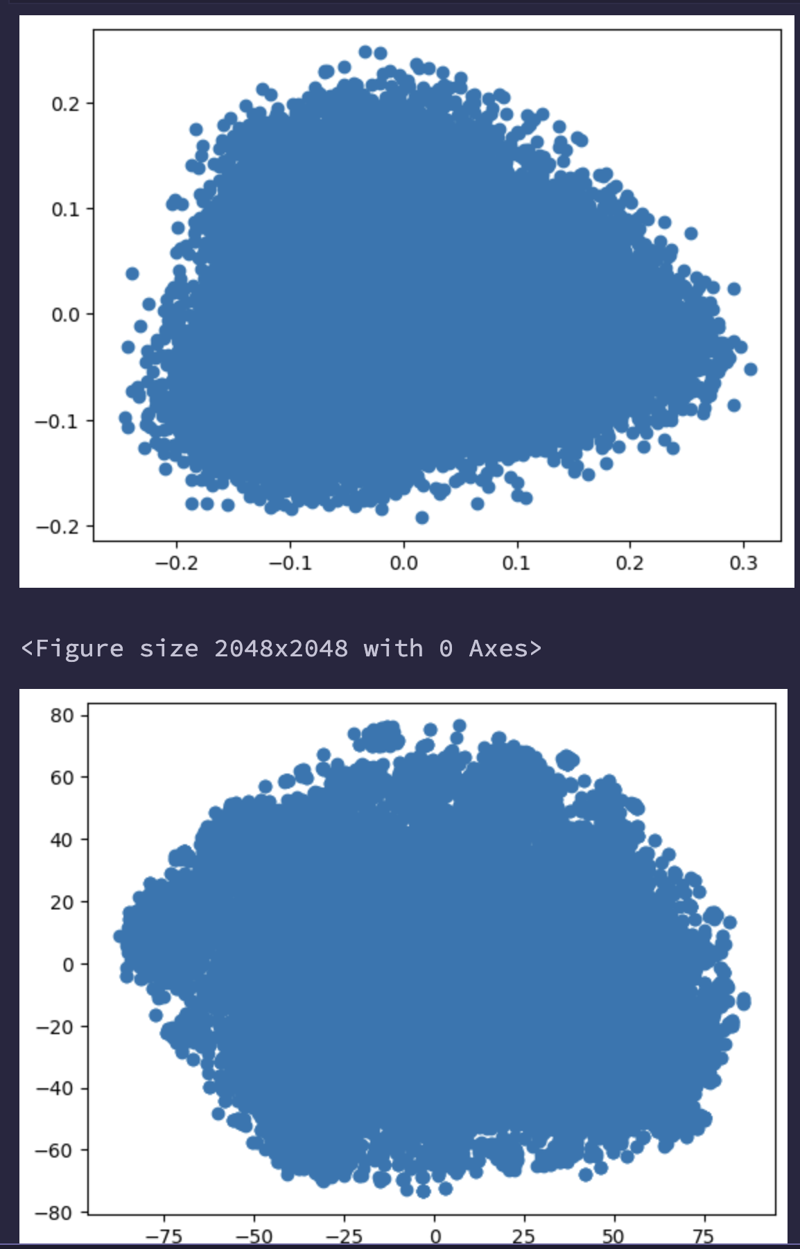
This wasn’t ideal, it kind of just looks like random noise. This got me thinking “I must be doing something wrong, maybe it’s just an optical illusion to how the chart was made, lets try 3d!” Here is a 3d rendering of the T-SNE points in 3d space.
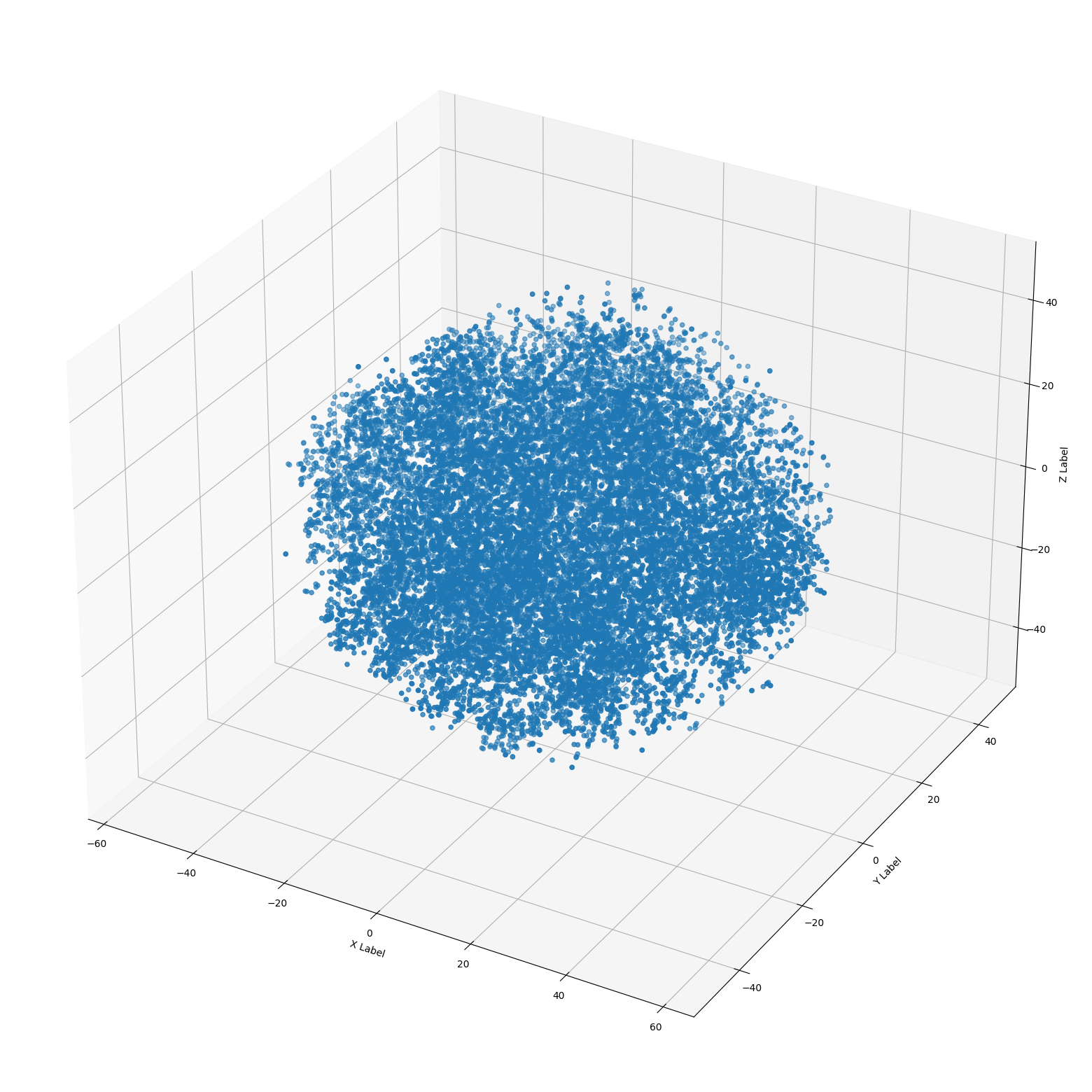
Nope! Still looks like noise… what gives? did I mess up the embeddings?
Then I discovered https://projector.tensorflow.org/ — a cool web app where you can load a .tsv file of all of your embedding vectors, and visualize them in an interactive 3d ui. In the UI, it’s super easy to toggle between PCA, T-SNE, and UMAP.
I recorded a quick video showing things, I thought the T-SNE animation through iterations was super cool.
While clustering did start to appear with UMAP and T-SNE at higher iterations, I still feel like the data is a little noisy. I wasn’t really able to make heads or tails about what any of the clustering meant.
I believe that the initial “noise” looking charts were perhaps due to going from 1536 dimensions down to 2 or 3. It seems like UMAP was the easiest way to begin digging into clustering.
I did end up indexing things into pinecone vector store, with the intention of using it as a service — but I had a bunch of API failures and issues with 502/503s. So in my next iteration, I’m planning to switch to chromadb, an open source alternative, built specifically for LLM usecases.
End of night progress update: I made a bunch of progress on this project, and recorded a little video walkthrough: